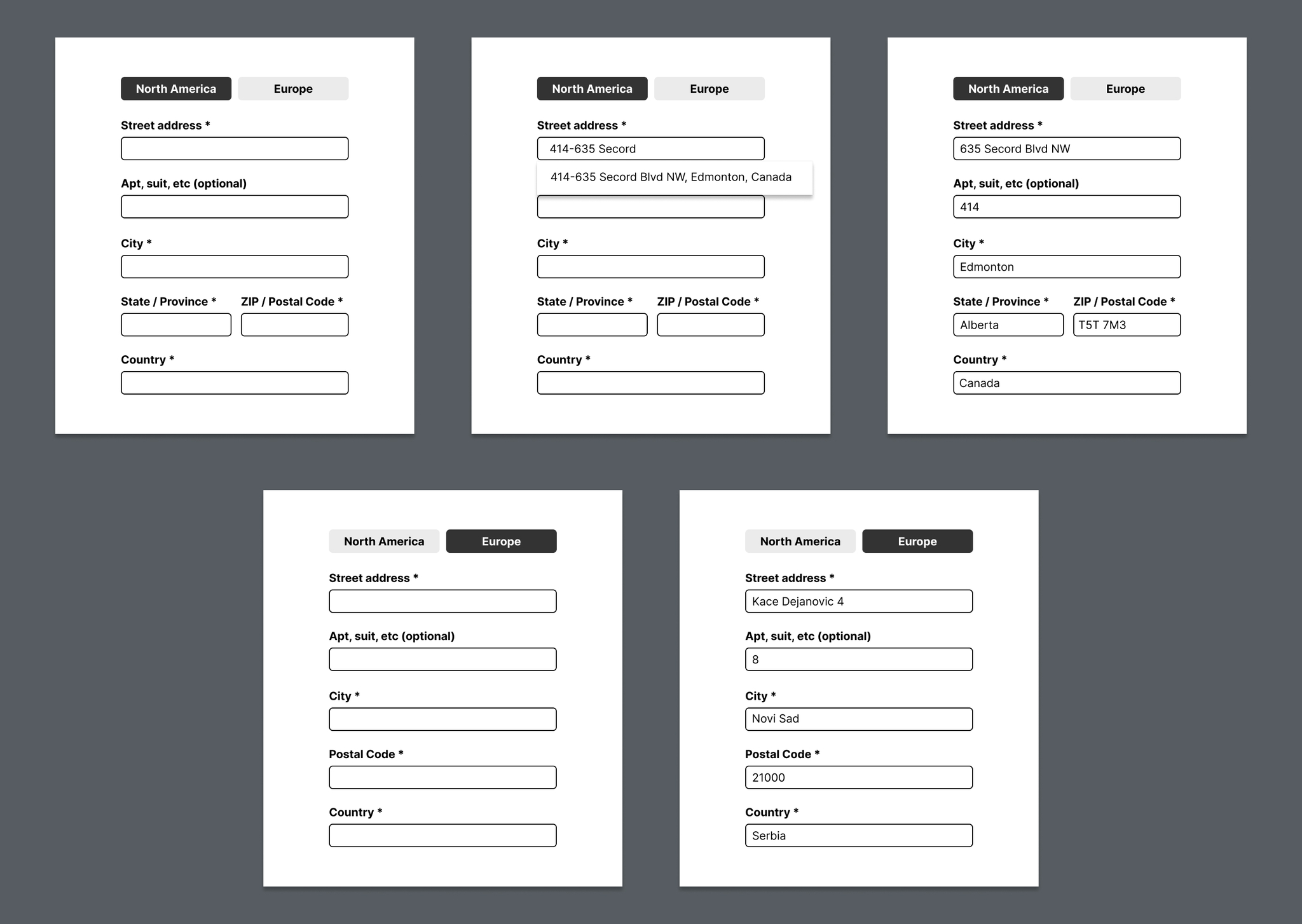
Form Address Optimization Strategy
The redesign replaces a fragmented, confusing address form with a clear, region-specific, and guided flow that reduces cognitive load through structured inputs, instant autocomplete, and consistent visual hierarchy
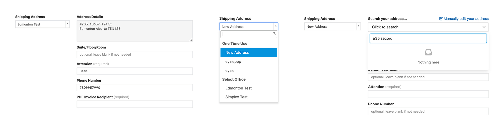
UX issues
- Fragmented flow — user must jump between fields and dropdowns; unclear what comes next.
- Three parallel forms (Existing Address / New Address / Manual Entry) confuse the hierarchy — users don’t know which to use.
- Empty autocomplete state gives no feedback (shows “Nothing here” instead of suggesting corrections).
- No country-level context — user can’t tell if the address is Canadian, US, or global.
- Lack of visual grouping — related fields (address, suite, city, etc.) are scattered. Inconsistent required-field labeling — “(required)” text everywhere adds clutter; better to mark once and highlight missing ones later.
- “Shipping Address” repeated multiple times — redundancy without helping orientation.
Result: Cognitive overload and uncertainty about where to begin or how to fix invalid entries.
Solution
- Region tabs (North America / Europe) tailor required fields to local address standards.
- Address autocomplete instantly suggests complete addresses as the user types.
- Optional fields like “Apt/Suite” appear secondary to essential fields, keeping focus on what’s required.
- Reduced cognitive load. All fields are vertically stacked and consistently labeled for quick scanning and easy completion.
- A standardized input sequence (Street → City → State/Province → ZIP/Postal → Country) minimizes confusion.
- The region switch accommodates international differences (e.g., European addresses without provinces).
- Immediate feedback. Autocomplete fills multiple fields simultaneously, reducing manual entry and errors.