Report Redesign: From Chaos to Clarity
The redesign reduced cognitive load, clarified key metrics, and made the interface scalable.
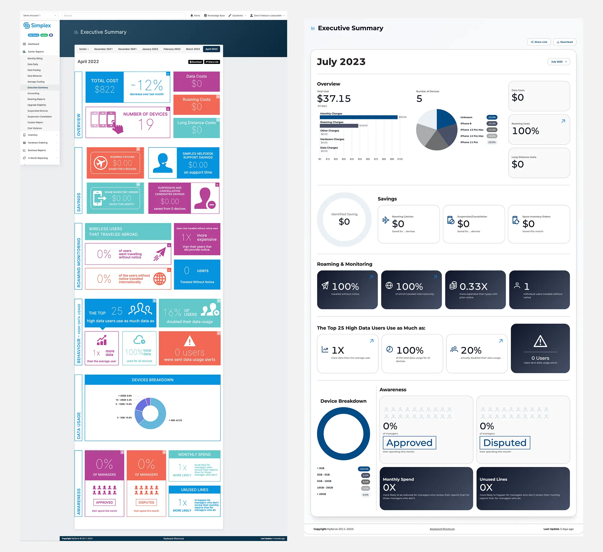
Before the redesign:
The interface looked like a collection of brightly colored cards. Each color competed for attention, with no visual hierarchy — everything seemed equally important. Information wasn’t grouped logically, text was dense, and numbers appeared in isolation.
As a result, users had to extract meaning from visual noise.
After the redesign:
The interface became calm and structured. We reduced the color palette, added whitespace, and grouped data into clear sections: Overview, Savings, Roaming, and Awareness. Numbers are now supported by charts and diagrams, making information instantly scannable. Typography and icons are consistent, and the grid brings order and visual balance.
Why it mattered:
The redesign reduced cognitive load, clarified key metrics, and made the interface scalable. Now it’s not just a set of numbers — it’s a clear, data-driven analytical tool.